![]()
The programmatic slogan of Satya Nadella When he takes the reins of Microsoft, "Cloud first, mobile first", he is creating movements that seemed unthinkable a few years ago. As many of you will know that those from Redmond published their own launcher on Google Play a few months ago, Arrow . After testing it for a season, we are going to measure its performance with an Android stock to see what plus it can offer us.
It seems like Microsoft it claims to fight Google on its own turf. Lately the great product the Android platform in terms of sales and media relevance, that is, the S model of Samsung Galaxy many of Redmond's signature apps are pre-installed. It is no longer just about developing Windows 10 but about making all native applications available on any platform by establishing complicity with users (and who knows if they sign up for their ranks in the future).
Here you go Arrow


On the other hand, Next It is a lock screen also developed by Microsoft. The truth is that it is an ideal complement for Arrow, although both have an independent operation.
Main approach
Arrow is Microsoft's bet in terms of interface to gain a foothold in Android. This launcher has nothing to do with the Windows tile format, on the contrary, it tries to adapt to the philosophy of Google's mobile system, although it raises a completely different desktop concept.
If on Android we are used to seeing a home screen with widgets and icons fixed, in Arrow things change and each screen that makes up the home has its own function. There is a first with widgets, a second with recent tasks, the third shows the most used applications, the fourth the last interactions with contacts and a last leaves space for notes and reminders.
App drawer and other details
The app drawer is quite reminiscent of Trebuchet of CyanogenMod, that is, it is an alphabetical ordering of the applications with the icons appearing listed next to their initial letter. In addition, the typography and the effects appear modified with respect to what we can see in a stock Android and they adapt more to the aesthetic lines that Microsoft's star applications may have. The colors of the default backgrounds are very soft and move away from the typical geometric shapes or the landscapes in a zenith plane of marshmallow.
Functional vs aesthetic
Still, where this launcher is truly powerful is in the matter of functionality and organizational optimization. Microsoft It has taken those sections that users use the most on their mobile or tablet and has given them a certain prominence by taking them to the home screen. Even so, the problem continues to be that the Android user has an enormously diverse profile and some of the sections in which it is distributed Arrow they probably won't fit everyone's guidelines.
We must recognize, however, the aesthetic value of the application. At least in my case the stock appearance of the home screens of Android Marshmallow It does not represent, precisely, one of its great strengths, rather the opposite, although I usually keep the theme of icons, the background is one of the first things I touch in a Nexus or a CyanogenMod. In the same way, the Arrow wallpapers (but not only, I would say that also those of HTC, Samsung or Xiaomi, by far) are much more suggestive to me.
Image gallery
-

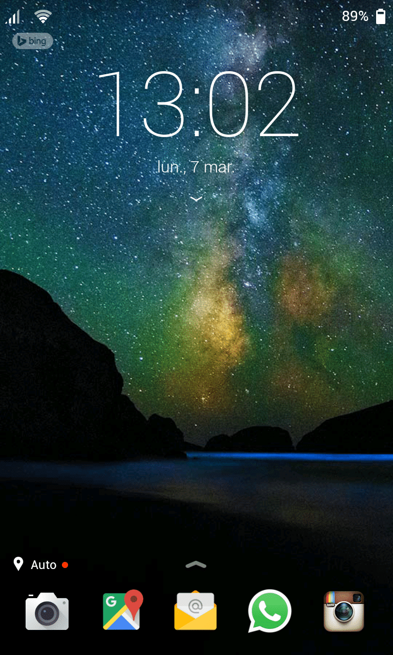
- Lock screen
-
- Home desktop
-
- Reminders and Notes
-
- Widgets screen
-
- Wallpapers
-
- App drawer
-
- Submenu