
As much for the daily work with documents, as for the web browsing, the use of the social networks or even the books and electronic items, reading is one of the most common uses on a tablet or laptop with Windows 10. Our interaction mediated by a screen, with others and with the world, is frequently textual. For this reason, our eyes will appreciate good visibility and a good outline of the letters, something easy to achieve by setting Cleartype.
Many of you will be familiar with ClearType technology: it is a system that Microsoft introduced in Windows XP and that smoothed out letters to make text easier to read on LCD panels. Since then, monitors have improved a lot and tablets, which have plagued the market, sometimes use laminated crystals that represent an improvement in the simply brutal experience.
However, there is always scope to get more convenient benefits and in this case it is no exception.

First of all, make sure that we work with a native resolution
All terminals leave the factory using their native resolution. However, when running a video game it may be that it has been modified and remained in a lower figure. Returning it to the initial resolution is simple. We just have to go to Settings> System> Screen> Advanced display settings. Unfold the box and select the recommended ratio.

In this case, I am writing this with my laptop and its native resolution, as you can see, is X. For the next step, we can go a little further down and click on the ClearType Text link.
If we prefer, we can also search ClearType in the search engine of the lower zone.
Adjust the text to your needs with ClearType settings
From here it is very simple. We need to make sure that ClearType is on and hit Next. Then we will be told if the screen is working with native resolution, a question that should already be resolved.
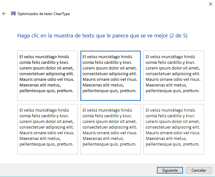
Now comes a series of boxes with text in which we can choose which one best suits our vision. Not all users will be the same, and sometimes the difference is really minimal, so we can play a little with different distances, perspectives y approaches to see which one convinces us the most. What we are shown are the same letters with more or less color in certain pixels to accentuate or soften their outline. As we say, a good choice will help us to read and, in general, to use our tablet more comfortably.
Source: howtogeek.com